Feedback
Last date modified: 2026-Jul-14
Communication Analysis
With the Communication Analysis widget, you can visualize communication frequencies, patterns, and networks between the entities linked to the documents in the view. You can add this widget to your dashboard after running name normalization.
Security permissions
The Communication Analysis Widget permission grants group members permission to add the Communication Analysis widget to a dashboard via the Add Widget drop-down menu. Groups without this permission can still view and interact with the Communication Analysis widget assuming they have access to the dashboard the widget is part of.
Documents that a user does not have permission to view are omitted from Communication Analysis. This means that entities that only exist in those documents are not included in the visualization and count calculations are adjusted accordingly.
Entities that a user does not have permission to view are omitted from the Communication Analysis visualization.
Feature Permissions provide an alternative to Relativity's security management by shifting the focus from Object Types and Tab Visibility to feature-based permissions. This method is an alternative option. Any feature-specific permissions information already in this and other topics is still applicable. The Feature Permissions interface enables administrators to manage permissions at the feature level, offering a more intuitive experience. By viewing granular permissions associated with each feature, administrators can ensure comprehensive control, ultimately reducing complexity and minimizing errors. For details see Instance-level permissions and Workspace-level permissions .
The following permissions are required for interacting with communication analysis:
| Object Security | Tab Visibility | Other Settings | Item-level Security |
|---|---|---|---|
|
|
|
|
Adding the Communication Analysis widget to your dashboard
To add the Communication Analysis widget:
- Navigate to the Documents tab.
- Click Add Widget to display a drop-down menu.
- Select Communication Analysis.
If name normalization has not been run, you can still add the widget, but an error message appears.
Understanding the Communication Analysis widget
The Communication Analysis widget queries and renders entity data directly from the Entity From and Entity Recipient document fields populated by name normalization.
By default, the visualization displays the largest 500 communicating entities identified within the document list view. Entities that fall outside the top 500 are not rendered in the visualization, even though they are still communicators within the document view. The communication counts are only based off of the entities rendered in the visualization.
For best results,
- keep all unique documents in your document view rather than inclusive email documents only.
- remove duplicate email documents so as not to double count a single communication.
Nodes
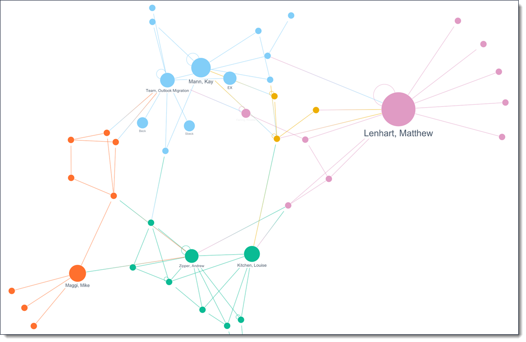
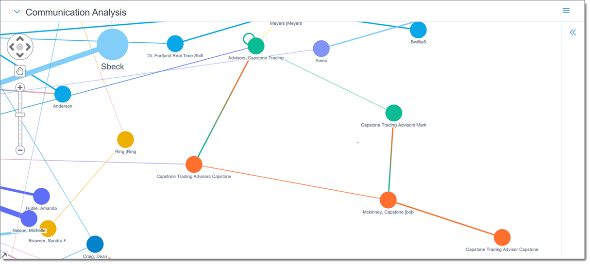
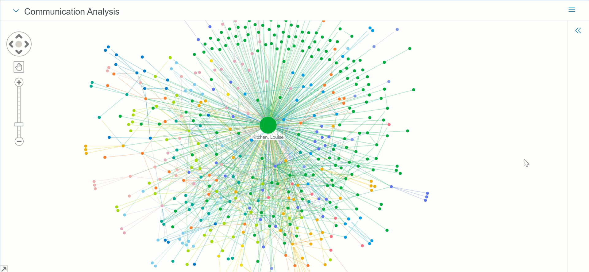
A node is a colored circled that represents each entity. Communications analysis groups nodes together that are in frequent communication with each other. It also assigns a color to each group of nodes. Nodes are sized based on the number of times the entity appears in the Entity From and Entity Recipient document fields, which represents the total amount of communications the entity was involved in. By looking at the size of the nodes in comparison to one another, you can determine the entity that communicated on the most documents.
Links
Links between entities display the color from each connected node to help you track communication amongst entities. Some nodes may have a link back to their own node. This indicates that the entity emailed themselves using two different email addresses they own. If a node is not connected to other nodes, it is called a detached entity, which means that they have not sent any communication to other entities in the visualization.
Communication Analysis widget options
You can perform the following actions on the Communication Analysis widget:
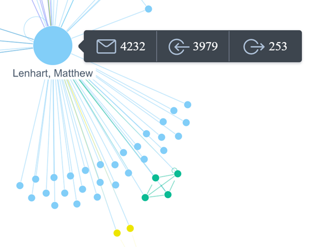
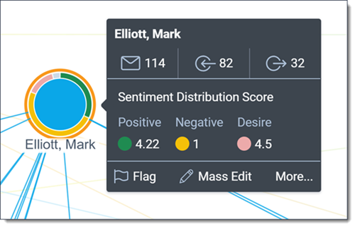
- Hover over a node—hover over a node to view the following details from left to right:
- Total—displays the sum of the Sent and Received counts. This value determines the node size.
- Received—displays the number of documents where this entity appeared in the Entity Recipient field.
- Sent—displays the number of documents where this entity appeared in the Entity From field.
Left-click options
Left-click on a node to select it and view information about that entity's communication. This information is the same as what displays if you hover your cursor over the node but with additional options displayed below to help you navigate the visualization.
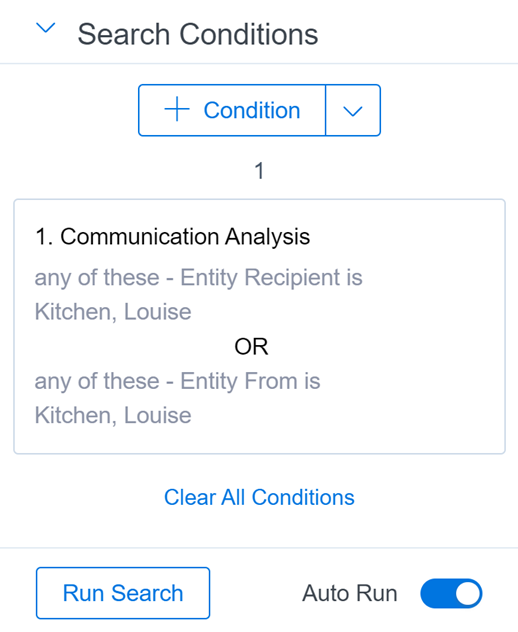
Optionally, you can also double-click on a node to add a search condition to the Search Conditions card. This action narrows the visualization down to where the selected entity is either a sender or recipient in a document.
If Auto Run search is enabled, the document list and visualization automatically re-renders with the search condition applied. If Auto Run search is disabled, you won't see any changes in the document list or visualization until you run the search. Selecting another node updates the conditions on the previously added search card and in the visualization.
Each piece of information and option that is available in the left-click menu is described below.
- Total—displays the sum of the Received and Sent fields. This value determines the node size.
- Received—displays the number of documents where this entity appeared in the Entity Recipient field.
- Sent—displays the number of documents where this entity appeared in the Entity From field.
- Flag—select to added a Flagged note to the selected nodes. You can remove the Flagged note by right-clicking on a node and selecting Unflag.
- Mass Edit—select this option and one of the following options to launch a pop-up window that contains editable fields for the desired object. You can then edit the entities or documents like you are using the mass edit operation.
The fields that display in the pop-up are determined by which layout is selected. You can change to a different layout by clicking on the Layouts drop-down menu in the upper-right and selecting the desired layout.- Entities—select this option to launch a pop-up window with the editable entities fields displayed. All documents where the entities are either in the Entity From or Entity Received fields are included in the mass edit operation.
- Documents—select this option to launch a pop-up window with the editable documents fields displayed.
- Select Groups—select this option to select the node that you left-clicked and each node that it has been grouped with. Nodes that are in the same group are assigned the same color in the visualization. The group includes nodes that have sent communication to the node you clicked on. Ones that have received communication from the node you clicked on, as well as the nodes that have communicated with those nodes as well. Each node that is selected will have an orange ring added to help you track which are currently selected.
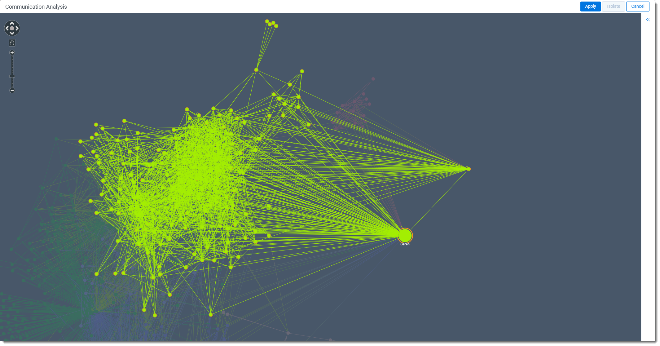
When comparing the Select Groups and Select Neighbors options, it is important to note that not everyone who is in direct communication will be in the same group. In the image below, Sarah and all of her neighbors, the people she has directly communicated with, are highlighted. You can see that she has direct communications to entities in several different groups.

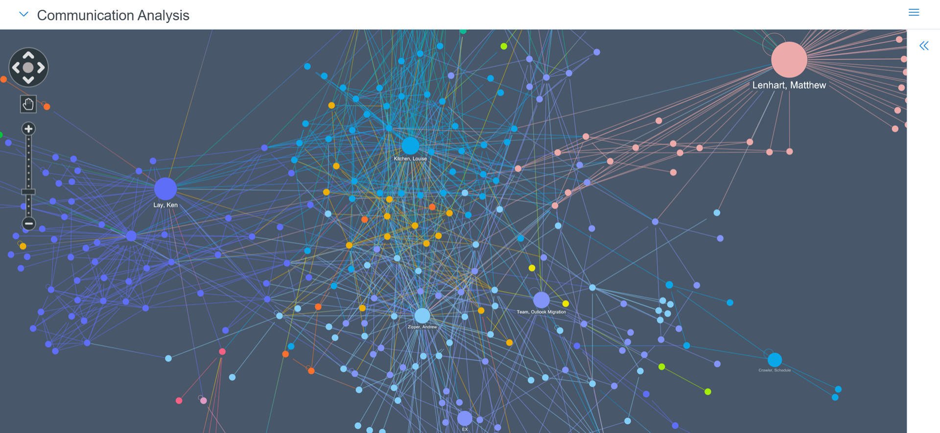
In the image below, Sarah is highlighted, along with her entire group. As you can see, there are entities in that group, mainly on the outside, that Sarah has not directly communicated with. A rough analogy for a group could be a department within a company. If you consider an HR department, likely not everyone in that department has sent direct communications to each other, but they are all part of the same group.
In the image below, Sarah is highlighted, along with her entire group. As you can see, there are entities in that group, mainly on the outside, that Sarah has not directly communicated with. A rough analogy for a group could be a department within a company. If you consider an HR department, likely not everyone in that department has sent direct communications to each other, but they are all part of the same group.
- Select Neighbors—select the node that you left-clicked on and all nodes that have sent or received communication from this node at once. Any nodes that were mass selected will remain selected after choosing this option. To make it easy to track which nodes are selected, each one that is selected has an orange ring added.
- Hide Selected—select to stop displaying each of the selected nodes. Once any nodes have been hidden, you can right-click anywhere in the widget, other than on a node, and select Show All Hidden Nodes to resume displaying each hidden node.
- Show All Hidden—select to resume display any nodes that were hidden using the Hide Selected option.
- Deselect All—select this option to deselect all currently selected nodes in the visualization.
Advanced options
Communication analysis provides filtering options that can be used in either multiple steps or mouse clicks.
- Isolate—select two nodes using Selection mode and then click Isolate to only display communication between the two nodes in the visualization. Alternatively, you can double-click the link between the two nodes to only display communication between the two nodes.
- Apply—click to apply the currently selected nodes to the Search Conditions card and the document list. Clicking Apply creates either a condition card of Entity Recipient is any node in the visualization or Entity From is any node in the visualization.
Widget navigation options
There are a number of navigational tools available to use while viewing the Communication Analysis widget.
- Directional controls—click the arrow in the direction you would like to move the view. Optionally, click the circle in the center of the directional controls to zoom the visualization out so you can see every node.
- Cursor/Selection mode—click on this icon to switch between the two modes. In Cursor mode, you can hold left-click and drag your mouse to move the view of the nodes. In Selection mode, you can left-click and drag your cursor to select multiple modes at once.
- Move the visualization—with Cursor mode selected, click and drag in any direction to move the visualization within the widget. If the widget moves out of view, click the Run Search button in the Search Conditions card to refresh the widget and bring the visualization back into view.
- Zoom in and out—use either the mouse wheel or the Plus and Minus icons to zoom in and out of the visualization. Alternatively, click anywhere on the slider to zoom in or out depending on where you select. Zooming in makes all nodes and links appear larger and helps you see the full entity name on smaller nodes.
- Navigation legend—click the arrow in the bottom-left corner of the widget to display the legend. Click and drag the selection box to move your view of the visualization to where you dropped the selection box in the legend.
Widget control options
There are several options you can use to control the Communication Analysis widget by clicking the menu in the upper-right corner of the widget.
- Maximize/Restore—select to display the widget at the largest size possible. Any other widgets, including the document list, will not be accessible while Communication Analysis is maximized. To return the widget to its previous size, click on the menu in the upper-right corner and select Restore.
- Close—select to close the Communication Analysis widget. Any widgets displayed will move up to replace the Communication Analysis widget.
- Dark Mode—select to change the widget's background color to a gray tone. This option can make the nodes easier to view in low-light settings.
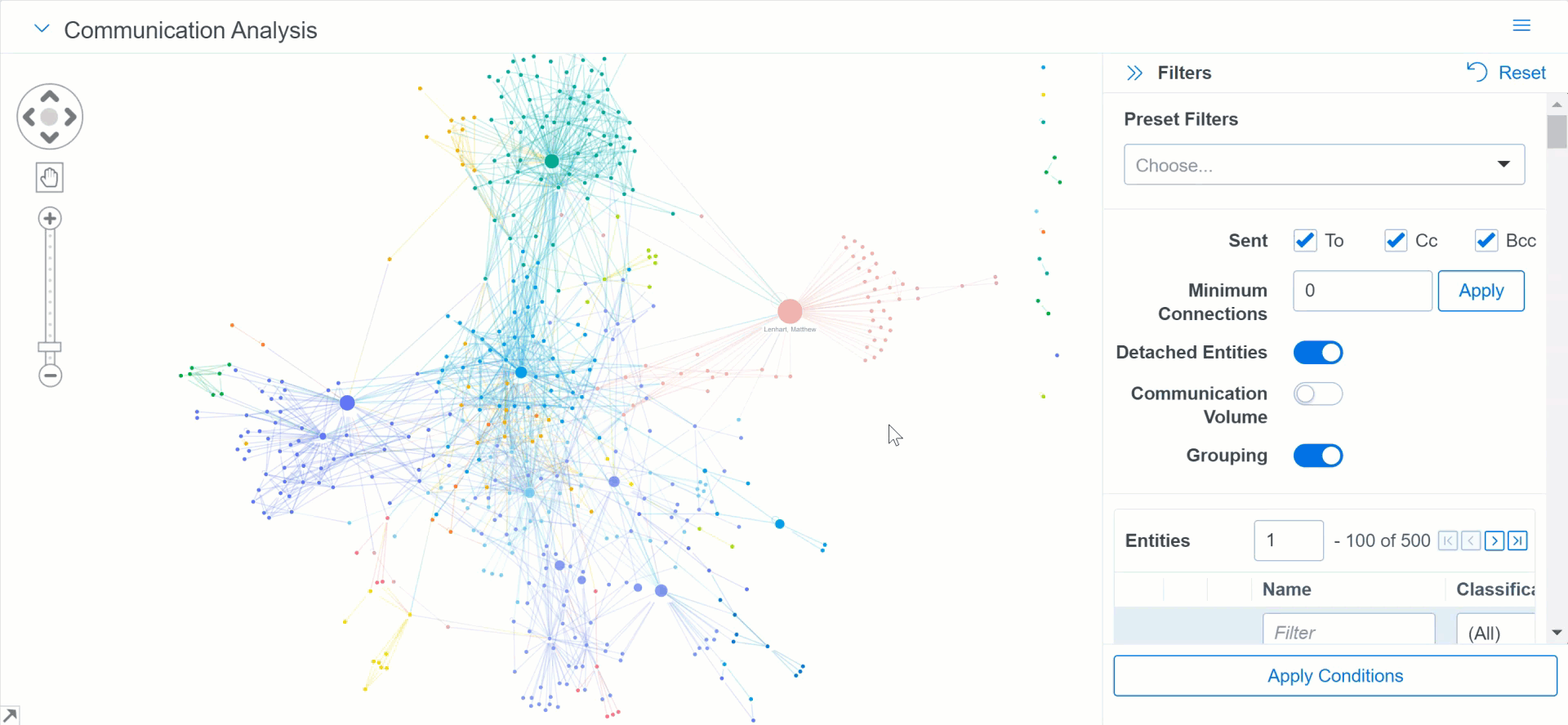
Filtering the Communication Analysis widget
Communication analysis can be filtered in a number of different ways to help you locate relevant information in the widget. Using the filter panel does not affect the document list unless you click the Apply Conditions button at the bottom of the panel.
An error message appears if no documents in your view have Entity From or Entity Recipient values. This can occur if you have filtered out documents that were analyzed by name normalization.
To access the filter options, click to expand the filter panel. Once expanded, the filter panel can be re-sized by hovering your cursor over left edge of the panel, and then clicking and dragging your cursor to the desired size.
The following options can be used to filter the results in the Communication Analysis widget:
- Preset Filters—optionally, select one of options to view X nodes that have sent and received the most communication in the visualization.
The fields that display in the pop-up are determined by which layout is selected. You can change to a different layout by clicking on the Layouts drop-down menu in the upper-right and selecting the desired layout. - Sent—determines what kind of recipients are displayed in the visualization. All of the options below are selected by default.
- To—if selected, recipients who were included in the To field of email communication are displayed in the widget. If unselected, recipients who were only included in the To field of email communication are not displayed in the widget.
- Cc—if selected, recipients who were included in the Cc field of email communication are displayed in the widget. If unselected, recipients who were only included in the Cc field of email communication are not displayed in the widget.
- Bcc—if selected, recipients who were included in the Bcc field of email communication are displayed in the widget. If unselected, recipients who were only included in the Bcc field of email communication are not displayed in the widget.
- Minimum Connections—enter the minimum amount of connections you wish to see displayed in the widget and click Apply. All nodes with fewer connections than the entered amount no longer display. If you wish to change or remove this filter, click the Reset icon.
- Detached Entities—if enabled, entities that are not connected to any other entities will display in the widget if they meet all other filtering requirements. If disabled, entities that are not connected to any other entities will not display in the widget regardless of other filtering requirements. This option is enabled by default.
- Communication Volume—if enabled, the line thickness between nodes will be thicker if there was a high amount of communication between the nodes and thinner if there was a lower amount of communication. If disabled, the line thickness between nodes is the same no matter how much communication occurred.
- Grouping—if enabled, nodes that communicate frequently with each other are assigned a group color to help make them easier to track in the widget. If disabled, all nodes are colored blue. This option is enabled by default.
- Sentiment—this option is only available if the Sentiment Analysis application is installed in a workspace.
If this option is enabled, a ring displays around any nodes that communicated in a document that was scored by sentiment analysis. You can hover your cursor over the colored segments in the ring to see how many documents have been scored for each sentiment.
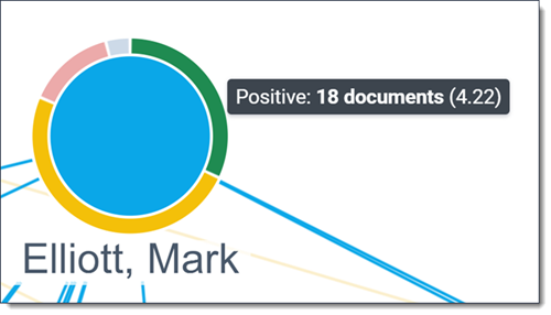
If you select a node with the ring, the Sentiment Distribution Score displays. This score is calculated by adding up each document with that sentiment for the node and then dividing that value by the number of documents with that sentiment. For example, if an entity has ten documents with Positive sentiment and total Positive distribution score is thirty, the Sentiment Distribution Score is 3.
- Entities—this section contains a list of entities that can be used to filter results in the Communication Analysis widget. The entities are ordered in the list from most communication to least communication. You can filter the Name and Classification columns to help narrow the list results. Optionally, use the following filter and navigation options to manage the visualization.
- Entity name—select entities you would like to include in the results. Any entities that are not selected are not included in the results.
- Locate Entity—click to ping and zoom the widget on the entity node.
- Focus on Entity—click to only display the selected entity node and any other entities that they communicated with.
- Apply Conditions—optionally, click to apply the currently selected options to the Search Conditions card and the document list. Clicking Apply Conditions creates either a condition card of Entity Recipientis any node in the visualization or Entity Fromis any node in the visualization. These conditions tend to increase the number of entities displayed in the visualization. To help you distinguish entities that displayed before Apply Conditions is clicked and after, any entities that are added after clicking the button have a reduced opacity. These entities will have a reduced opacity until a new filter is applied or the visualization re-renders.