


Feedback
Last date modified: 2026-Feb-05
Dashboard and pivot quick reference guide
Use this guide to navigate, create, and edit your dashboard and pivot tables.
| Dashboard areas | ||
|---|---|---|
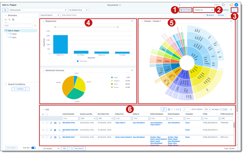
| 1 | Add Widget button | Adds a pivot or cluster widget to the dashboard. |
| 2 | Dashboard drop-down menu | Click to change dashboards or create a new one. An icon displays on the left side of the menu if your dashboard has unsaved changes. |
| 3 |
Export Dashboard button |
Click to export this dashboard's charts to Excel for further customization. |
| 4 | Pivot widget | Displays a bar graph, stacked bar graph, pie chart, line chart, or table. |
| 5 | Cluster widget | Displays the selected cluster. |
| 6 | List | Displays the item list. |

|
Collapse toggle | Minimizes the widget. |

|
Menu | Provides options for working with the displayed widget. |
| Dashboard drop-down options | ||
|---|---|---|
| New Dashboard | Creates a new blank dashboard. | |
| Save | Saves the current dashboard | |
| Save as | Saves changes to a new dashboard. | |

|
Edit | Edits the selected dashboard. |

|
Delete | Deletes the selected dashboard. |
| Widget menu options | |
|---|---|
| Edit / Edit Pivot | Edits the Pivot or lets you choose the cluster for a cluster widget. |
| Save Pivot profile | Saves a new pivot profile from the current one. |
| Maximize | Maximizes the widget. |
| Close | Removes the widget. |
| Display Type | Choose Bar Chart, Stacked Bar Chart, Line Chart, or Table. |
| Export PNG | Exports the widget as a .png image file |
| Export XLSX | Exports the widget as a .xlsx Excel file. |
| Show (blank) | Shows or hides totals in the chart to improve readability. |
| Show Legend | Toggles the display of the Pivot chart legend. |
| Horizontal Orientation | Arranges the information horizontally |
| Vertical Orientation | Arranges the information vertically. |