


Feedback
Last date modified: 2026-Jul-17
Running Pivot reports
To enable the Add Widgets button and Pivot functionality for an Relativity Dynamic Object (RDO), you must select Enabled for the Pivot property in the Object Type Information section for the object.
The Pivot menu displays options to run reports on pivot-enabled fields in views and saved searches.
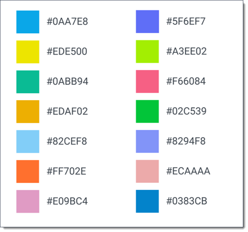
Pivot color map
The Pivot color map has been expanded to include 14 colors. When a chart is created, the color map checks to see if there are already colors assigned to a value in the chart. If there are assigned colors, the chart will maintain those colors. If not, a new color will be assigned for that value to help maintain color consistency.
The following colors are in the color map:
Adding a Pivot widget
To add a new pivot chart to a dashboard:
- Click Add Widget, and then select Pivot from the drop-down menu.
- Select the desired chart type by clicking on its thumbnail.
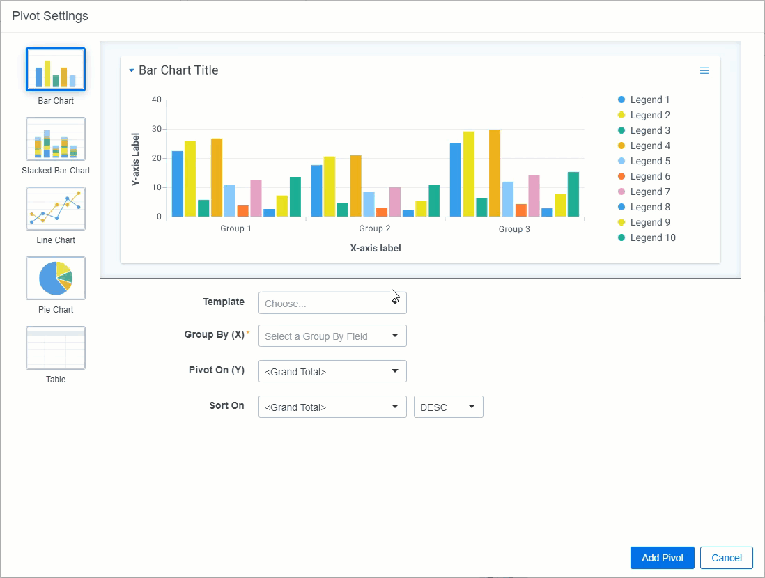
- Perform one of the following to define settings for your Pivot widget:If you would like to select a Group by (X) or Pivot On (Y) field that does not have the Enable By option enabled, click on either Group by (X) or Pivot On (Y), hover your cursor over desired field in the list, and click the Enable icon on the right side of the row. Click Yes to allow the field to be used in pivots and select that option for either Group by (X) or Pivot On (Y).
- Select an existing Pivot profile from the Template drop-down menu. The Group By (X) and Pivot On (Y) fields populate with the settings defined by that Pivot profile. You can select an existing Pivot profile, then modify the settings in the Group By (X) and Pivot On fields. None of your changes are saved to the Pivot profile unless you save your new profile. See Pivot options.OR
- Select a field from the Group By (X) drop-down menu to define the horizontal axis of the pivot report.
- (Optional) Select a field from the Pivot On (Y) drop-down menu to break down the totals that appear in each row. This acts as the vertical axis of the Pivot report.
If you select a date field in either the Group By (X) or Pivot On (Y) field, the Date drop-down menu displays in the same row as that field.
Select the desired date option:- Every Day - summarizes on each day.
- Every Week - summarizes every week.
- Every Two Weeks - summarizes every two weeks.If Every Week or Every Two Weeks is selected, the results are displayed from Sunday through Saturday.
- Every Year - summarizes on each year.
- Every Month - summarizes on each month.
- (Optional) When you select a Group By (X) or Pivot On (Y) field, the Group By Results Returned field displays underneath. The Group By Results Returned field allows you to specify the number of results that will be returned. From the drop-down menu, select All, Top, or Bottom and in the field to right of the drop-down menu, enter the number of results you'd like to see displayed in the Pivot. For example, you can set the Pivot to display the top ten responsive designations for each custodian.
- (Optional) After setting the Group By (X) and Pivot On (Y) fields, you can select a field from the Sort On drop-down menu and then select a sorting method, which determines how the displayed values for the selected field will be sorted on the screen.
- Select an existing Pivot profile from the Template drop-down menu. The Group By (X) and Pivot On (Y) fields populate with the settings defined by that Pivot profile.
- Click Add Pivot.
The Pivot widget now appears on your Dashboard. Each other panel on the page is automatically re-sized or moved to accommodate the new widget.
You can size and move panels to create the configuration you prefer. Click and drag to zoom in on the Pivot display. You can hover over any item to get a specific count for that item or click any item to drill down and view more information for that specific item.
Click the value name in the legend to toggle it on and off.
Pivot options
Once you've added a Pivot widget to your Document list page, you can configure settings for the Pivot. Click the Toggle widget menu icon at the top right of the Pivot widget to display the Pivot options pane.
The Pivot options pane has 4 sections: Properties, Display Type, Export, and Options.
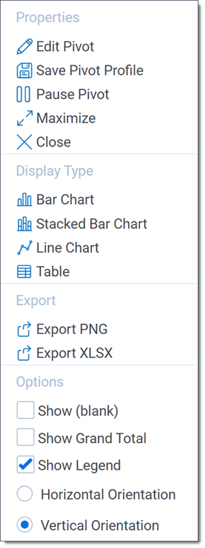
Properties
From the Properties section, you can edit the Pivot, save a Pivot profile, maximize the Pivot widget, or remove the widget.
- Edit Pivot - Displays the Pivot Settings window in which you can edit the Pivot settings.
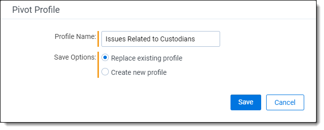
- Save Pivot Profile - Displays the Pivot Profile window in which you can replace or create a new profile.
- To replace the selected Pivot profile with the current settings, leave the default name in the Profile Name field and select Replace existing profile.
- To create a new Pivot profile with the current settings, enter a new name in the Profile Name field and select Create new profile.
- Pause Pivot - Select to freeze the content in this pivot so that the information displayed is not affected by searching or filtering the document list. When a pivot is frozen, a paused message displays in the widget to help you track its status. You can unfreeze a pivot by clicking the Resume Pivot button in the widget. Once a widget is resumed, a search or filter must be applied to update the information displayed in the pivot.
- Maximize - When you maximize a widget, it takes over the whole Document list screen. To restore a maximized widget to the size it was before you maximized it, click the icon in the upper right and select Restore.
- Remove - Click Remove to delete the widget.
Display type
From the Display Type section on the Pivot options pane, you can change the display type for the Pivot. Select from the following:
- Bar Chart
- Pie Chart (available when you select only a Group By (X) value)
- Stacked Bar Chart (available when you select both a Group By (X) and Pivot On (Y) value)
- Line Chart
- Table
Export
From the Export section on the Pivot options pane, you can export the Pivot to one of the following formats:
- Export PNG - exports the chart as a PNG image file and automatically downloads it locally.
- Export XLSX - exports the chart as a Microsoft Excel Document where you can modify and configure the chart using Excel's built in chart functionality.
Options
From the Options section on the Pivot options pane, select the checkboxes to display blank values, show grand total, display the chart horizontally or vertically (for bar and stacked bar charts), choose whether to display the legend.
Working with Pivot chart results
By default, the Pivot chart displays your results as a graph using the Group By (X) field as the horizontal axis and the Pivot On (Y) field as the vertical axis. To change between different chart or choose different options, click the Toggle widget menu icon at the top right of the pane, then select a chart type from the Display Type section.
You have the following options:
- Using bar charts
- Using pie charts
- Using stacked bar charts
- Using line charts
- Filtering the Document list from a Pivot chart
- Exporting a Pivot or cluster visualization widget
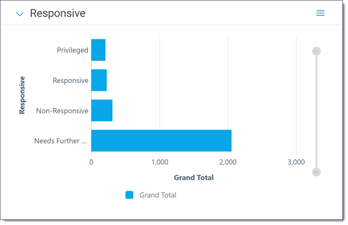
Using bar charts
The bar chart displays results in a standard bar format. If you have multiple Pivot On (Y) results for your Group By values, the chart displays those results next to each other. Hover over a specific item to view details about that item. Using the Pivot options pane, you can select whether to display the chart vertically or horizontally.
You can click on the circle on either end of the slider to determine how zoomed in or out the bar chart is. Click on the circle within the chart to zoom back out.
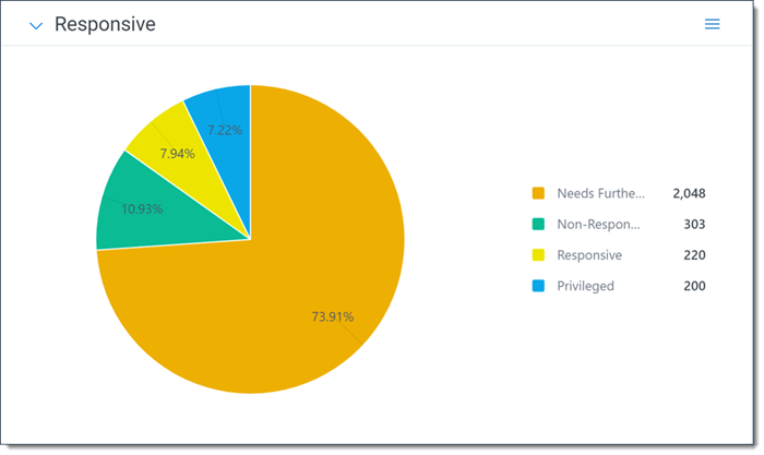
Using pie charts
The pie chart displays results in a standard pie format. Hover over a specific item to view details about that item.
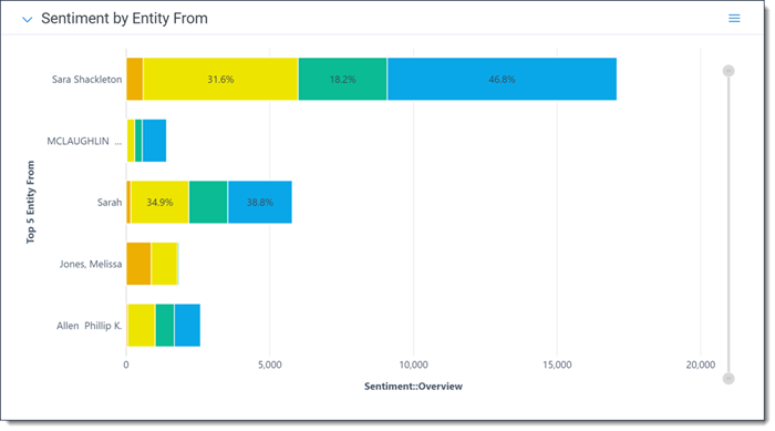
Using stacked bar charts
If you have multiple Pivot On (Y) results for your Group By (X) values, the stacked bar chart displays those results in a streamlined, comprehensive bar. Hover over a specific item to view details about that item. Using the Pivot options pane, you can select whether to display the chart vertically or horizontally.
You can click on the circle on either end of the slider to determine how zoomed in or out the stacked bar chart is. Click on the circle within the chart to zoom back out.
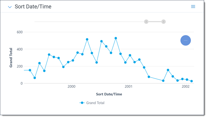
Using line charts
The line chart displays results in a standard line format. Hover over a specific item to view details about that item. You can also drag and drop a gray box on the smaller version of the line chart above the legend to zoom in on particular areas of interest on the chart.
You can click on the circle on either end of the slider to determine how zoomed in or out the line chart is. Click on the circle within the chart to zoom back out.
Filtering the Document list from a Pivot chart
Using any chart type, you can click any item to view more information. From this modal, you can select Mass Edit to launch the mass edit operation for the related object. You can double-click on an item to filter the Document list so it only displays the results from that item. To activate multi-select mode and select multiple ranges of values for bar and pie charts, use Ctrl + Click. To select a range of points on a line chart, click and drag.
Exporting a Pivot or cluster visualization widget
Use the Pivot Options pane for the widget to save the information outside of Relativity. You can select from the following options:
- Export PNG - exports the widget as a PNG image file and automatically downloads it locally.
- Export XLSX - exports the widget as a Microsoft Excel Document where you can modify and configure the chart using Excel's built in chart functionality Exporting to Excel functionality does not require Microsoft Excel to be installed (except for viewing of the exported file).
To export a widget:
- Click the Toggle widget menu icon at the top right of the relevant widget to display the options pane.
- Select Export PNG or Export XLSX. The generated filed is automatically downloaded locally to your computer.
- Open the file on your computer to view the result.
- If you exported the widget to Microsoft Excel, you may use Excel's built in chart functionality to edit the chart and its data as needed. Please note that you cannot modify cluster visualization widget data in Excel.
If you want to export all the widgets on your dashboard to an Excel file, refer to Exporting a dashboard.
Working with Pivot table results
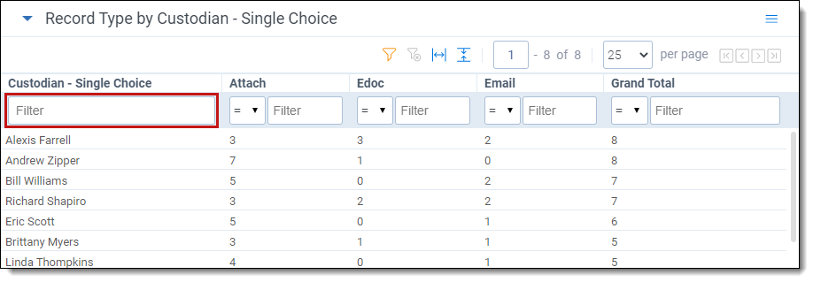
The Pivot table displays your results using the Group By (X) field as rows (horizontal axis) and the Pivot On (Y) field as columns (vertical axis). In the example below, the grid displays rows for each custodian and columns for each record type designation.
From the table results, you can modify the sort order of the results. By default, your Pivot results are sorted in descending order based on the Group By (X) field. You can modify the sort order by clicking on any of the column headers. Click once for a descending sort, and twice for ascending.
Filtering the Document list from a Pivot table
In the Pivot table, click any cell once to highlight it. Click Apply to confirm. The Document list refreshes to display only the results from the cell you selected.
To clear the filter, click Clear All Conditions in the Search Panel.
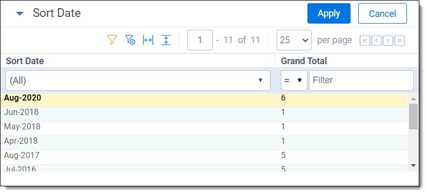
Filtering on numeric fields in a Pivot table
In a Pivot table, you can filter on any numeric field to return results that match a certain operator. In the Pivot table display, click the filter icon to apply a filter on a numeric field. From the drop down shown in that field, select an operator:
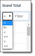
- = (equal to)
- != (not equal to)
- < (less than)
- <= (less than or equal to)
- > (greater than)
- >= (greater than or equal to)
Once you've selected an operator, enter a numerical value in the filter textbox, then click Enter to apply the filter. When a filter is applied, the Hide Filter icon appears in the heading of the column.
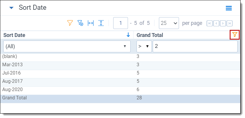
To clear the filter, click the Clear Filter icon.
Filtering on the Group By (X) field in a Pivot table
In the Pivot table, you can filter on results from the Group By (X) field. You can limit results to a specific value or range for the field you've selected as the Group By (X) field (in this example, the field Custodian - Single Choice is the Group By (X) field). To filter for specific results on the Group By (X) field, enter a numerical value in the text field at the top of the column.
To clear the filter, click the Clear Filter icon.