


When you've created a page configuration you'd like to preserve, you can create a customized dashboard. You can save multiple dashboards to quickly change the page configuration. The item list and any widgets on the dashboard will update automatically in response to filtering or searching. Dashboards only report on data within the workspace you are in.
Note: For a list of dashboards that provide an effective starting point for administrators to help review teams visualize their data set, see the Creating commonly-used dashboards.
(Click to expand.)
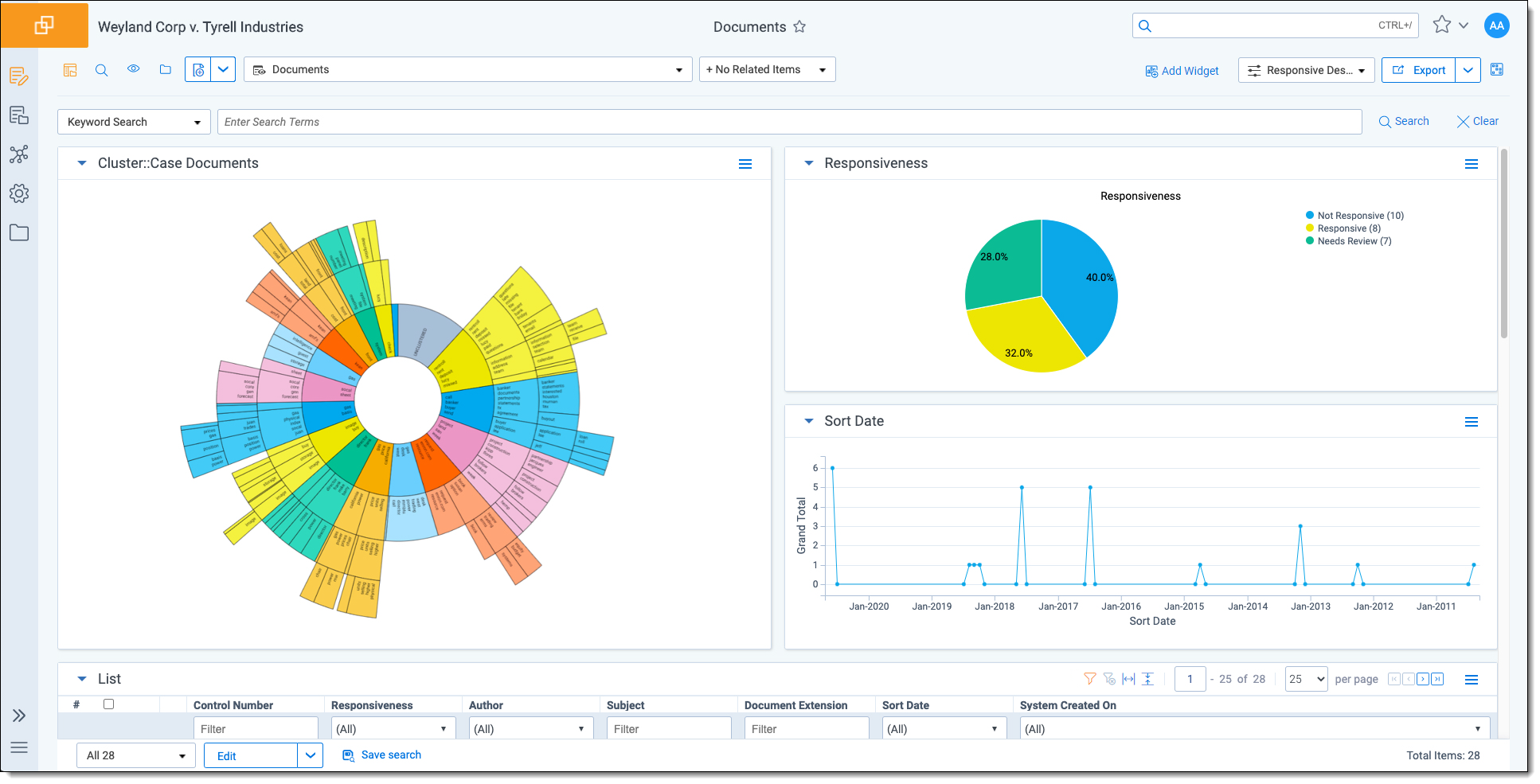
The page initially appears with the folder browser on the top left, the search panel on the bottom left and the item list to the right. Within this new framework, you have multiple options for customizing your display.
You can resize, move, or collapse any panel on the page, including any widgets you create.
- To resize any panel, hover over the line separating the item list from the panel until you see the mouse pointer change to horizontal arrows, then click and drag.
- To move, hover over the top of the panel until you see the
 icon. Then, click and drag the panel to the new location.
 - To collapse the search panel or browser pane, click the
 icon. Once collapsed, click the
  icon to restore the browser pane or the
  icon to restore the search panel.
Additionally, you can drag and drop panels to rearrange on the page. Click any panel and drag it to a new location. The other panels will automatically move to accommodate the panel you're dropping.
Dashboards and widgets can be copied over to newly created workspaces if they are part of a template. Dashboards only report on data within the workspace you are in if data is loaded in the workspace.
Note: You must have the correct workspace permissions to add, edit, or save a dashboard and to save pivot widgets to your dashboard.
You can also export individual Pivot widgets to Excel or to PNG format from each widget's context menu. See
Note: To enable the Add Widgets button and Pivot functionality for an Relativity Dynamic Object (RDO), you must select Enabled for the Pivot property in the Object Type Information section for the object.
Creating a dashboard
To create a dashboard:
- Click the Dashboards drop-down menu in the top right corner of the screen.
Note: You can only access the drop-down if Pivot is Enabled for the given object type.
- Click New Dashboard to save the current page configuration as a new dashboard.
- Enter a name and an order number for the dashboard.
Note: The dashboard with the lowest order number will appear by default when you log in to Relativity.
Adding widgets to a dashboard
You can add the following widgets to customize your dashboard:
- Pivot charts and tables - You can use Pivot to summarize data in tables or charts to visually analyze trends in your data.
- Cluster visualizations - On the Documents tab, you can use Relativity Cluster Visualization to render your cluster data as an interactive visual map by adding a Cluster Visualization widget. This offers you a quick overview of your document cluster sets and quickly drill into each cluster set to view subclusters and conceptually-related clusters of documents.
- Communication Analysis - After running the name normalization operation within structured analytics, you can use this widget to visualize communication frequencies, patterns, and networks between the entities linked to the documents in the view.
Note: When you reach the maximum number of widgets allowed on a dashboard, the Add Widget button will be grayed out and a tooltip displays when you hover over it that lets you know the reason you cannot add any additional widgets to your dashboard. This is controlled by the MaxNumberDashboardWidgets instance setting.
Saving changes to a dashboard
You can also make changes on the fly and save a dashboard with the changes. If a dashboard has not been saved, an orange notification displays in the Dashboard drop-down menu until it is saved.
- Click the Dashboards drop-down menu in the top right corner of the screen to display the list of dashboards available on the current tab.
- Click Save to save the changes to the existing dashboard. Click Save As to save the page configuration as a new dashboard, and then enter a Name and Order number.
Note: If a dashboard is part of a locked application, the option to save the dashboard is unavailable.
Deleting a dashboard
To delete a dashboard from the current tab you are in, click the  icon to the right of the dashboard you want to delete in the Dashboards drop-down menu.
Click Delete in the Delete Dashboard Confirmation popup to delete the dashboard.
Note: If a dashboard is part of a locked application, the option to delete the dashboard is unavailable.
Renaming a dashboard
To rename a dashboard:
- Click on the
 icon next to the name of the dashboard in the Dashboard drop-down menu.
 - Enter a Name and an Order number for the dashboard. The order number controls the order in which the dashboard displays in the list.
- Click Save to save your changes.
Note: If a dashboard is part of a locked application, the option to edit the dashboard is unavailable.
Exporting a dashboard
You can export the pivot charts and cluster visualization images on your dashboard to Microsoft Excel. The charts can then be modified as needed in Excel. Cluster visualization images cannot be modified using Excel, however, since they are a PNG image of the visualization.
Note: Exporting to Excel functionality does not require Microsoft Excel to be installed (except for viewing of the exported file).
To export your dashboard to Excel:
- On your current dashboard, click the
 button to the right of the Dashboard drop-down to export your dashboard with the currently selected export format settings.
 - Dashboard name - selecting this means the name of the dashboard will be included in the export.
- Export date and time - selecting this means the date and time of the export will be included in the export.
- Show data worksheets - selecting this means the data for the individual widgets will be included in the export (and you can then modify this data).
- Relativity logo - selecting this means the Relativity logo will be included in the export.
- User Name - selecting this means the username that created the export will be included in the export.
- View Name - selecting this means the name of the view from which the export was generated will be included in the export.
- Workspace Name - selecting this means the name of the workspace will be included in the export.
Alternatively, click the drop-down arrow to the right to make the following export format setting selections, and then click the ![]() button at the bottom of the drop-down menu. By default, all listed items are selected, but the individual selections that you make persist until you change them.
button at the bottom of the drop-down menu. By default, all listed items are selected, but the individual selections that you make persist until you change them.
- Click on the new Excel document that was downloaded locally to open it.
Relativity will automatically generate and download the new Excel workbook locally for you.
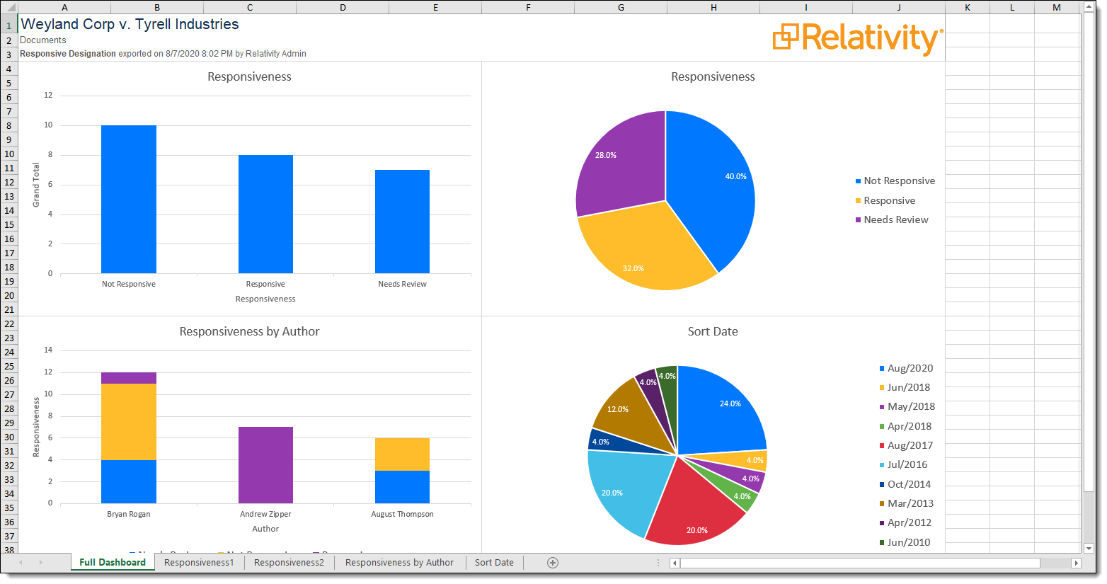
The full dashboard displays on the Full Dashboard worksheet tab. The individual charts that make up your dashboard along with their data can be found on the subsequent worksheet tabs.
Note: If you export a scroll-able table widget, it will not be shown on the Full Dashboard worksheet tab.
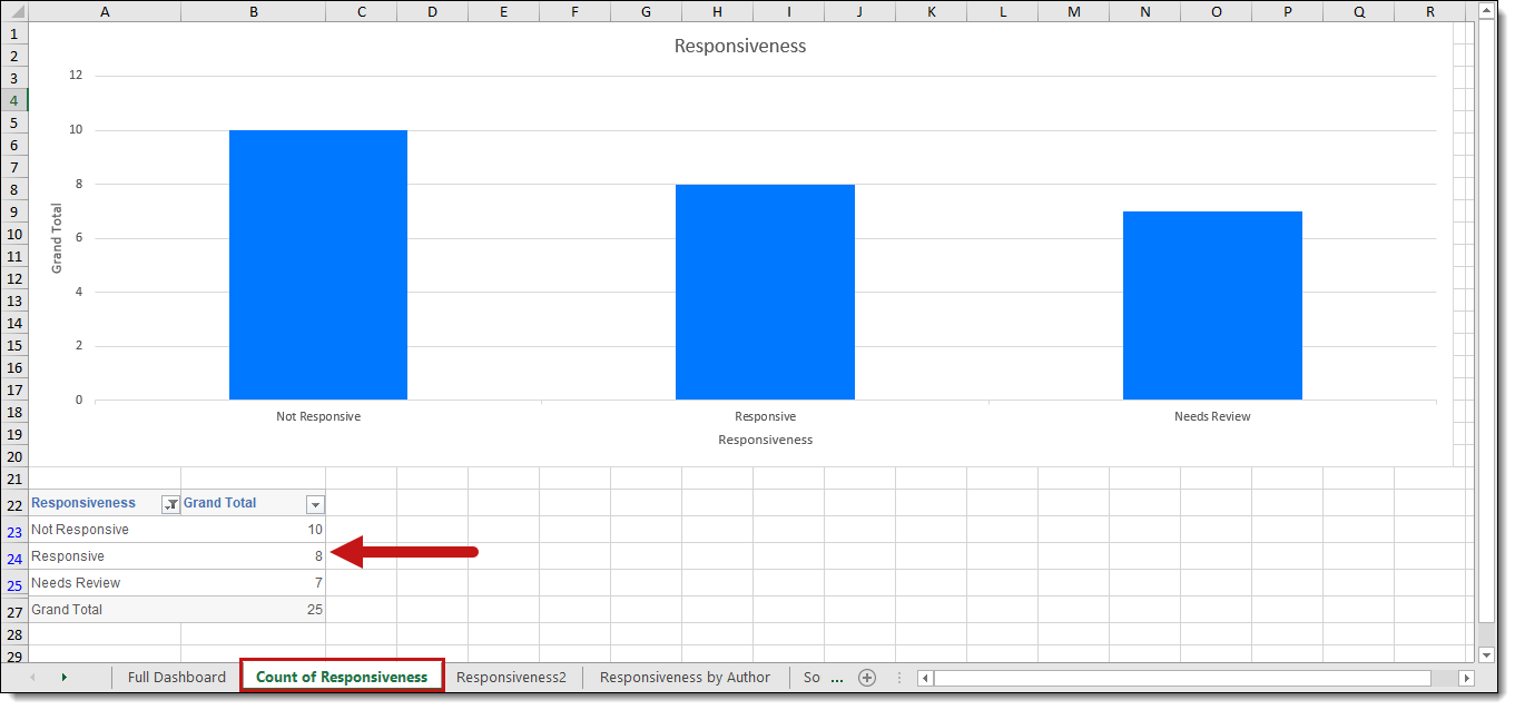
- You can modify the data on the relevant worksheet for the chart and all the charts including the Full Dashboard worksheet update to reflect the modified data using Excel's built in chart functionality. Furthermore, the data table is sortable and filterable—the chart will reflect the data listed in the table. You can refer to user documentation on how to use charts in Microsoft Excel for more information on modifying these charts for other purposes.
Note: You cannot modify any cluster visualization using Excel, since this is just a PNG image of the visualization.
Note: You can also export individual Pivot widgets to Excel or to PNG format from each widget's context menu. See