


Adding fields and text
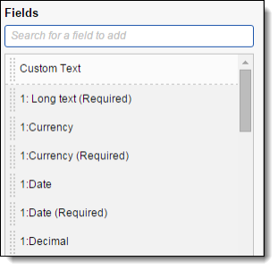
Use the fields in the Layout Options console to create your layout. Search for available fields in the search box. Relativity automatically places wild cards at the beginning and end of the entered characters. The list of available fields is dependent on the layout Object Type and any fields created with the same Object Type.
This page contains the following sections:
- Layout options
- Adding fields to a category
- Removing fields from a category
- Making a field one or two column
- Making a field read-only
- Other fields considerations
- Field properties
Layout options
The Layout Options contain the following fields:
- Field - displays the name of the field that is added. You can select any available workspace field. You can add a specific field only once to the layout.
Note: You can't add fields stored in Data Grid to layouts.
- Display Type - controls how the field appears on the layout. The field type determines the available display options:
- Fixed length - text appears as text.
- Whole number - appears as an integer.
- Date - appears as a date.
- Yes/no - has three values - blank, yes, or no. This field can be displayed as a drop-down menu, checkbox, or radio button list.
- Long text - appears as text.
Note: If a field with long text is selected and it contains enough text, the long text field may affect the display of other fields in the layout that are beneath it.
- Rich text - appears as text with bold and italics. This option is only available if the field has the Allow HTML property set to Yes.
Note: The Sanitizer object controls whether HTML attributes are sanitized and how specific HTML content is sanitized from fields on page render. You can modify the sanitizer object to add HTML alerts and links. We recommend not modifying the default setting.
- Single-choice list - appears as a drop-down menu or radio button.
- Decimal - appears as a decimal.
- Currency - appears as currency.
- Multiple-choice - list can appear as a checkbox list or pop-up picker. A pop-up picker displays the field label and a box containing the current field values. Reviewers click
 , which displays a filterable list of field choices. Filtering can be applied to pop-up picker views to find choices. For more information on the pop-up picker, see Pop-ups on the layout.
Note: If a coding layout becomes long and cumbersome, change the field display from checkbox list to pop-up picker. This unclutters the layout by effectively hiding the field's choices and presenting them only if necessary. Displaying a large number of choices with check boxes, drop-down menus, or radio buttons on a layout can also slow performance. The display type automatically flips to a pop-up picker if the number of choices exceeds the configurable choice display limit.
- User can appear as a drop-down menu or a picker.
- Repeat Columns controls how single and multiple-choice lists appear on a layout. When you select this option for a multiple-choice field, choices are ordered left to right, and top to bottom.
- Single Column Display: Enter 0, 1, or leave the option blank.
- Multiple Column Display: Enter any value higher than 1 to set the number of columns.
A value of 2 results in a two column display.
A value of 3 results in a three column display.
- Single Column Display: Enter 0, 1, or leave the option blank.
- Custom label is used to display your own text instead of the field name. Click
 button to enter your custom label.
Adding fields to a category
To add fields to a category, drag and drop a field from the Fields section to the category. Drop Field placeholder text appears to indicate where you can place fields on the category.

Removing fields from a category
To remove a field from a category, click  next to the field. The layout builder moves that field back to the Fields list for future use.

Making a field one or two column
To make a one column field two columns, click  .
.

To make a two column field one column, click  .
.
Making a field read-only
To make a field read-only, click  .
.

Note: The option Allow Copy from Previous is disabled for fields that have their Read-Only option set to Yes, as well as for system and relational fields such as MD5 HASH. See Copy from Previous.
Other fields considerations
- You can drag and drop fields from one category to another.
- You can drag and drop fields from one column to another.
- Add custom text by dragging and dropping the Custom Text field to a layout. To edit, select the Custom Text field and edit the Custom Text in the text box or the rich text editor. If you enter rich text, the message Rich text added appears. See Using the rich text editor.
- Certain HTML-enabled text fields such as Email Threading Display may not display correctly if you add them to a layout.
Field properties
Depending on the field selected in the layout builder, different properties appear. Below is a list of the following field properties:
Display Type - controls how the field appears on the layout. The field type determines the available display options:
- Fixed length - text appears as text.
- Whole number - appears as an integer.
- Date - appears as a date.
- Yes/no - has three values - blank, yes, or no. This field can be displayed as a drop-down menu, checkbox, or radio button list.
- Long text - appears as text.
Note: If a field with long text is selected and it contains enough text, the long text field may affect the display of other fields in the layout that are beneath it.
- Rich text - appears as text with bold and italics. This option is only available if the field has the Allow HTML property set to Yes.
- Single-choice list - appears as a drop-down menu or radio button.
- Decimal - appears as a decimal.
- Currency - appears as currency.
- , which displays a filterable list of field choices. Filtering can be applied to pop-up picker views to find choices. For more information on the pop-up picker, see Pop-ups on the layout.
Note: If a coding layout becomes long and cumbersome, change the field display from checkbox list to pop-up picker. This unclutters the layout by effectively hiding the field's choices and presenting them only if necessary. Displaying a large number of choices with check boxes, drop-down menus, or radio buttons on a layout can also slow performance. The display type automatically flips to a pop-up picker if the number of choices exceeds the configurable choice display limit.
- User can appear as a drop-down menu or a picker.
- Show Name Column displays the field name as label when you select this checkbox. Clear the checkbox to hide the label.
- Rows (long text only) is used to set the number of visible lines in a long text box, such as attorney comments.
- Custom label is used to display your own text instead of the field name. Edit the Custom Text in the text box or click to open the rich text editor. See Using the rich text editor. If you enter rich text, the message Rich text added appears.