


Feedback
Cluster visualization
Cluster visualization renders your cluster data as an interactive map allowing you to see a quick overview of your cluster sets and quickly drill into each cluster set to view subclusters and conceptually-related clusters.
This can assist you with the following actions:
Scenario: Your case team is working on a matter when you receive a large number of documents from some new custodians. A deadline is looming and you need to get these documents reviewed as quickly as possible.
What you can do with cluster visualization:
- Apply filters for key search terms in cluster visualization to create a heat map that will identify important documents.
- Select the darker clusters first, and then mass edit those documents to set them at a high review priority.
- Create an auto-batching set that uses the high review priority field to automatically batch documents out after they are tagged with a high review priority to get the important documents to reviewers as quickly as possible.
- Explore the nearby clusters view of your documents to see which documents are conceptually similar to the darker clusters, and mass edit those clusters to set the high review priority field and add them to the auto-batching set to get them to other reviewers as quickly as possible.
- Use the cluster search panel to filter out the documents that do not have the review priority field set to only see the documents clusters that have not been batched out for review.
Scenario: Your team has recently taken on a new matter. Documents have been collected from key custodians, but they have not yet been interviewed. You have read the complaint and have an idea what the case is about, but review has not yet begun, and you are not sure what all is in your data set.
What you can do with cluster visualization:
- Visually explore and assess your documents in the clusters view to get a sense of the topics or subject matter of your documents.
- Find additional search terms from the clusters to add to your search term list.
- Weed out or de-prioritize documents in clusters that are irrelevant by selecting a cluster and mass editing a review priority field.
Scenario: Your team has just inherited a case from another firm. You have also received an opposing production in this matter. In both instances, you want to quickly organize these new, unknown document sets by issue to facilitate your review.
What you can do with cluster visualization:
- Leverage existing issue coding and categorization within cluster visualization by displaying only documents coded for an issue (e.g., Accounting) to see in which clusters those issues are common. You can then disable the filter for the issue to view all documents within the cluster and then batch out the untagged documents for review.
- Use existing Assisted Review categorization to see where the documents that have been categorized by the system fit into your cluster set by creating a filter for a specific category to see where most of the documents for that category reside visually. Next, you can view nearby clusters to select and tag new clusters of documents that are conceptually similar to a specific issue for review by a certain group of reviewers that can review them for that specific issue or category.
Scenario: Your first-level review team has just completed its review of a set of documents and your QC team is ready to get started.
What you can do with cluster visualization:
- Identify patterns that may indicate coding inconsistencies by creating a cluster filter using the designation / responsiveness field to show only documents that are coded as responsive. You can then select the clusters that have a high responsive percentage and mass edit a review priority field to use for batching these documents out quickly for a QC review.
- Ensure you didn’t miss responsive documents by selecting conceptually related document clusters that haven't been tagged as responsive to the clusters with a high degree of responsiveness and mass edit a review priority field to batch the related documents out quickly for QC review.
Scenario: Your team has decided to use Assisted Review on a new, large matter. You plan to perform a manual review on all documents, but you are using Assisted Review to prioritize your review, so you can focus on responsive documents first. Following initial witness interviews, your team has identified a handful of responsive documents that are good examples, but you would like to find more like these to use as examples to train the system.
What you can do with cluster visualization:
- Use cluster visualization to locate additional example documents based on this set of documents, by creating a cluster set of documents from the Assisted Review project and filtering by the Example field to find clusters that contain the most existing example documents. Select these clusters, and then and then use mass edit to tag the untagged documents in the clusters as potential examples.
- Create a saved search that returns these potential example documents to quickly assemble a subset of documents that are likely to contain good examples for the Assisted Review training round.
See these related pages:
Visualizing a cluster
Cluster visualization is integrated with the Documents tab, so you can add a cluster visualization widget directly to your Dashboard.
To view multiple cluster sets, you must create different dashboards. There can be only one cluster visualization widget on a dashboard at a time.
- To use Cluster Visualization, you must have workspace permissions to the clusters browser.
- Permissions for Cluster Set object and the multiple choice fields that hold cluster data should be kept in sync.
Visualizing a cluster from the Cluster browser
To visualize a cluster from the Cluster browser, complete the following steps in your workspace:
- Click
 on the Documents tab to open the Cluster browser.
 - Select a cluster on the Cluster browser.
- Click the Visualize Cluster button, or right-click the cluster and click Visualize Cluster.
The cluster visualization widget displays on your Dashboard and defaults to the first level of clusters that exist under the cluster you selected . If you selected a subcluster, it still defaults to the first level of clusters under the parent cluster that contains your selection.
If you select a new first level cluster from the Cluster browser, the widget refreshes and the title of the widget is updated to reflect your new cluster selection. If you select a new subcluster, the widget refreshes to display the relevant heat mapping. With any change in cluster selection in the Cluster browser, any cluster filters that have been created from selecting clusters are discarded from the search panel.
Adding a cluster visualization widget to your Dashboard
To add a cluster visualization widget to your Dashboard, complete the following steps in your workspace:
- Navigate to the Documents tab.
You do not have to be on the Clusters browser to add a cluster visualization. You can create a cluster visualization from the Folders and Field Tree browsers as well.
- Click Add Widget to display a drop-down menu.
- Select Cluster Visualization from the Add Widget drop-down menu.
The Cluster Visualization Settings pop-up appears.
- Select the Cluster Set you want to create an interactive visual map for, and then click Apply.
The cluster visualization widget displays on your Dashboard and defaults to the first level of clusters that exist under the cluster you selected .
Selecting a new cluster set to visualize
You can change the existing cluster set that you are visualizing in one of the following ways:
- If you want to visualize other clusters from the Clusters browser, simply select a new cluster set in the tree on the left. The existing Cluster Visualization is updated with your new selection.
- From any browser, you can click the icon in the top right corner of the widget, and then select Edit from the Properties menu to launch the Cluster Visualization Settings pop-up, and then select a new cluster set.
To view multiple cluster set visualizations, you must create a different dashboard for each one. There can be only one cluster visualization widget on a Dashboard at one time.
Understanding the types of cluster visualizations
You can click and pan on cluster visualizations to move around the cluster, dial or circle pack visualization at any level of depth using any of the following cluster visualizations:
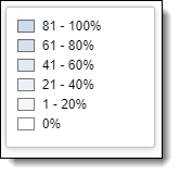
All types of visualizations display a legend that is used for heat mapping. See Understanding the Cluster Visualization heat map for more information on how to use this legend.
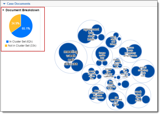
Additionally, when you are navigating outside the Cluster browser (for example, you click on a specific Folder or field tree item), the document list contains documents that are not necessarily in the cluster set you selected. A Document Breakdown pie chart is present for both types of visualizations. This chart provides a visual breakdown of documents in the document list below (percentage of listed documents that are found in the visualized cluster set and percentage of listed documents that are not in the visualized cluster set). See Using the Document Breakdown chart.
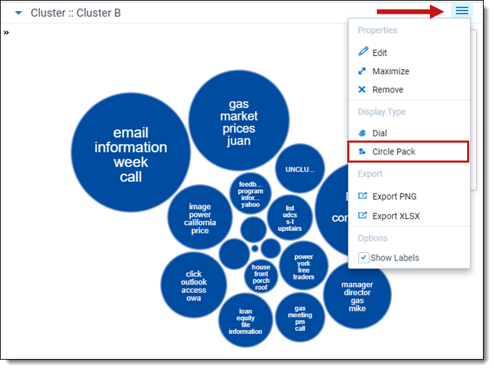
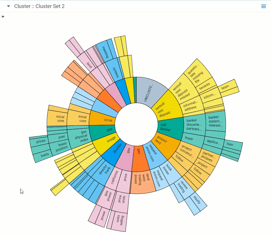
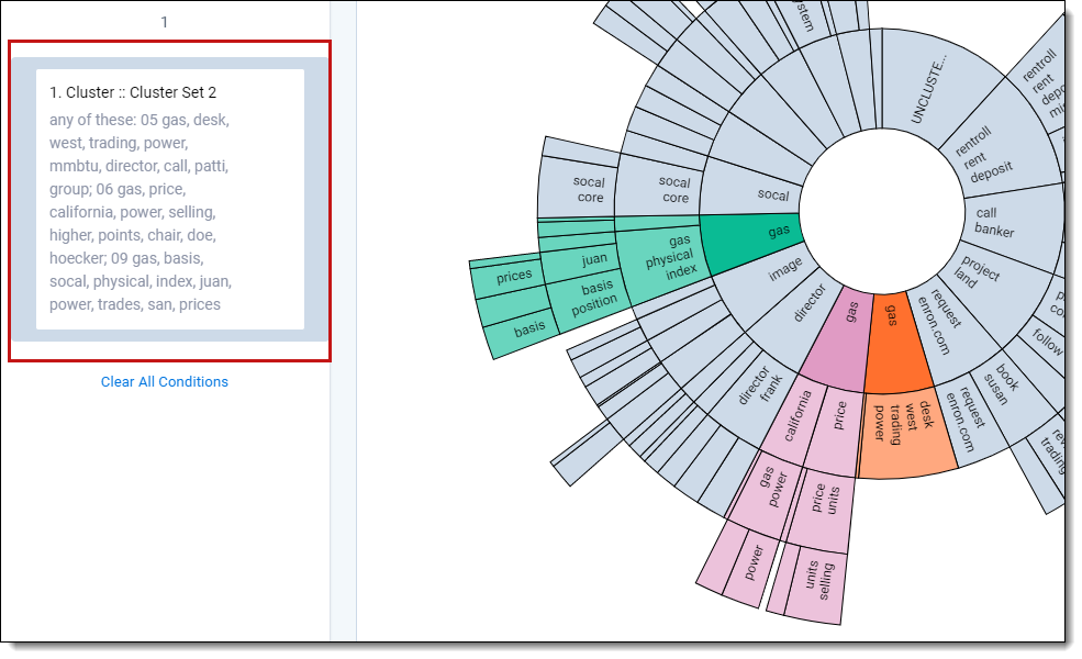
Circle pack
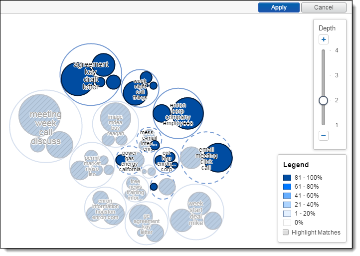
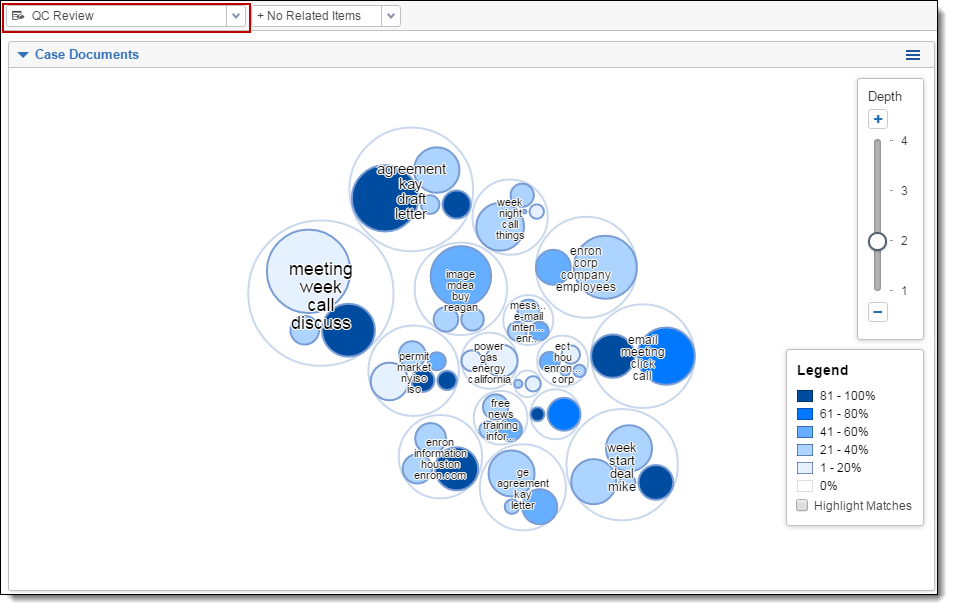
The circle pack visualization arranges clusters in a circular pattern by order of the number of documents in each cluster, with the largest cluster representing the one that contains the greatest number of documents. To access the circle pack, click on the hamburger icon in the top-right corner of the widget. Next, click Circle Pack.
Circle pack actions
Perform any of the following actions on the circle pack visualization:
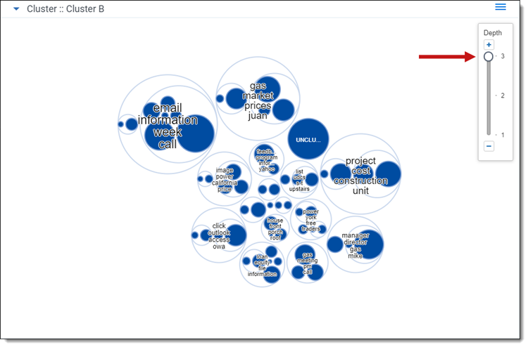
- Adjust the depth - click an individual cluster in any ring to the level of cluster detail you see. A higher depth value reveals subclusters that exist in each cluster.
- Move the clusters - click and drag anywhere on the cluster panel to move the set of clusters on the panel. The changes in position can be saved when you save your dasbhoard.
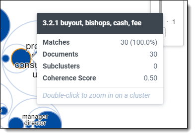
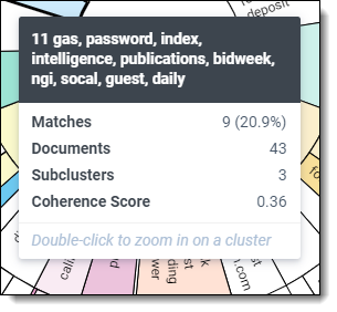
- Hover over a cluster - hover over a cluster or subcluster to view the following details:
- Matches - number and percentage of documents that match the criteria included in your view and filter configurations. The matching documents count only shows when you have a view with conditions applied and/or filters applied to your cluster visualizations.
- Documents - number of documents found in a cluster.
- Subclusters - number of lower-level clusters found in a cluster.
- Coherence Score - measurement of how closely related the documents are to each other within a cluster. See Cluster fields for a description of minimum coherence for clustering.
- Zoom in on a cluster - double-click on a cluster or subcluster to automatically drill into it and view its subclusters in greater detail. Hover over the subclusters to view their details and continue zooming in by clicking a lower-level subcluster. The changes in zoom can be saved when you save your dashboard.
- Zoom out - double-click the open space of the circle pack visualization to zoom out from a cluster. The changes in zoom can be saved when you save your dashboard.
- Control+Left-click - Control+left-click to select one or more clusters on the circle pack visualization to apply as a filter. Once you select one or more clusters, you must click Apply to apply your selection as a filter or click Cancel. See Applying filters to visualized clusters.
- Right-click - right-click a cluster or anywhere inside of the circle pack visualization image to perform one of the following actions:
- Select/Select All - select one or select all clusters to apply as a filter. See Applying filters to visualized clusters.
- Clear Selection - clear a selection of one or more filters you chose with the Select or Select All actions.
- View Nearby Clusters - opens the nearby clusters visualization with the focus centered on the selected cluster.
- Show or hide the cluster labels - clear the Show Labels checkbox to hide the cluster terms. Select the Show Labels checkbox to show the cluster terms.
- Show or hide the Circle Pack visualization - click
 next to the top-level cluster name to hide the circle pack visualization panel. Click
  to show the circle pack visualization.
 - Document Breakdown pie chart actions - When you are navigating outside the Cluster browser, you can click on In Cluster Set or Not in Cluster Set section of the pie chart to filter for those specific documents. See Using the Document Breakdown chart.
Right-clicking outside a cluster reveals only the Select All and Clear Selection actions.
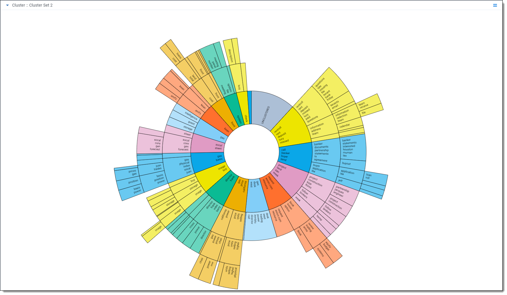
Dial visualization
Cluster Visualization defaults to the dial visualization when you click Visualize Cluster on the cluster browser.
Dial visualization is a different representation of the circle pack. The visualization arranges documents in a circular pattern, with clusters containing the greatest number of documents on the inside. The dial's inner ring, or primary cluster, is equivalent to the top cluster in the cluster browser. The secondary, tertiary, and quaternary rings are child clusters of the primary cluster. Each segment shows up to 10 terms.
Dial visualization actions
Perform any of the following actions on the dial visualization:
- Zoom in on a cluster - double-click on a cluster or subcluster to automatically drill into it and view its subclusters in greater detail. Hover over the subclusters to view their details and continue zooming in by clicking a lower-level subcluster. You can save the changes made in zoom when you save your dashboard.
- Zoom out - double-click the center circle of the dial visualization to zoom out from a cluster.
- Control+Left-click - Control+left-click to select one or more clusters on the dial visualization to apply as a filter. Once you select one or more clusters, you must click Apply to apply your selection as a filter or click Cancel. See Applying filters to visualized clusters.
- Right-click - right-click a cluster or anywhere inside of the dial visualization image to perform one of the following actions:
- Select/Select All - select one or select all clusters to apply as a filter. See Applying filters to visualized clusters.
- Clear Selection - clear a selection of one or more filters you chose with the Select or Select All actions.
- View Nearby Clusters - opens the nearby clusters visualization with the focus centered on the selected cluster.
Right-clicking outside the dial reveals only the Select All and Clear Selection actions.
- Hover over a cluster - hover over a cluster or subcluster to view the following details:
- Matches - number and percentage of documents that match the criteria included in your view and filter configurations. The matching documents count only shows when you have a view with conditions applied and/or filters applied to your cluster visualizations.
- Documents - number of documents found in a cluster.
- Subclusters - number of lower-level clusters found in a cluster.
- Coherence Score - measurement of how closely related the documents are to each other within a cluster. See Cluster fields for a description of minimum coherence for clustering.
- Document Breakdown pie chart actions - When you are navigating outside the Cluster browser, you can click on In Cluster Set or the Not in Cluster Set section of the pie chart to filter for those specific documents. See Using the Document Breakdown chart.
- Legend - percentage of documents that meet certain filter criteria applied in the browser panel. Darker shades denote a higher match, while lighter shades signify less accuracy.
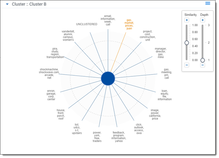
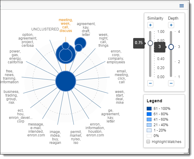
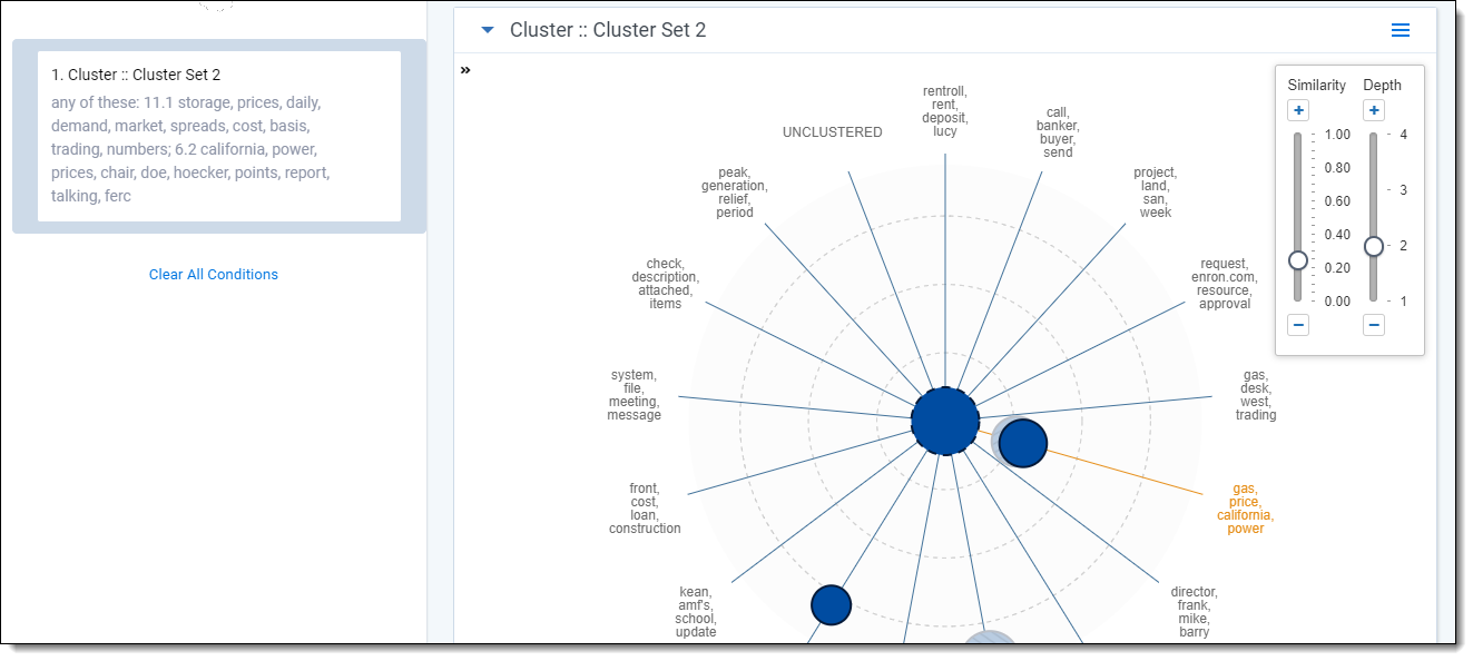
Nearby clusters
The nearby clusters visualization reveals clusters conceptually similar to a selected cluster. To open the nearby clusters visualization, right-click a cluster and click View Nearby Clusters.
The nearby clusters visualization arranges clusters based on conceptual similarity to a selected cluster. The cluster you selected is positioned in the center with other clusters positioned according to the degree of similarity. The higher the similarity, the closer a cluster is positioned to the center. The lower the similarity, the farther the cluster is positioned from the center.
Nearby clusters actions
Perform any of the following actions on the nearby clusters visualization:
- Adjust the similarity score - slide the similarity control up or down or click
 or
or  to increase or decrease the level of similarity shown on the nearby clusters visualization. A higher similarity value shows clusters closer in conceptual similarity to the center cluster you selected.
 - Adjust the depth - slide the depth control up or down or click or to increase or decrease the level of cluster detail you see. A higher depth value reveals subclusters on the Nearby clusters visualization.
Hover over a cluster - hover over a cluster to view the following details:
- Matches - number and percentage of documents that match the criteria included in your view and filter configurations. The matching documents count only shows when you have a view with conditions applied and/or filters applied to your cluster visualizations.
- Documents - number of documents found in a cluster.
- Subclusters - number of lower-level clusters found in a cluster.
- Coherence Score - measurement of how closely related the documents are to each other within a cluster. See Cluster fields for a description of minimum coherence for clustering.
Right-click - right-click on a cluster or anywhere inside of the nearby clusters visualization image to perform one of the following actions:
- Select/Select All - select one or select all clusters to apply as a filter. See Applying filters to visualized clusters.
- Select Visible - select all clusters visible in the nearby clusters visualization to apply as a filter. See Applying filters to visualized clusters.
- Clear Selection - removes all filters you applied using the Select, Select All, or Select Visible actions on the nearby clusters, dial and circle pack visualizations. For additional information regarding editing, disabling, and removing filters, see Editing cluster filters.
- Close Nearby Clusters - closes the nearby clusters visualization and returns to either the dial or circle pack visualization.
Control+Left-click - Control+left-click to select one or more clusters on the nearby clusters visualization to apply as a filter. See Applying filters to visualized clusters.
Using the Document Breakdown chart
The Document Breakdown pie chart provides a visual breakdown of documents in the document list below (percentage of listed documents that are found in the visualized cluster set and percentage of listed documents that are not in the visualized cluster set).
You can click on the Document Breakdown pie chart to filter the Document List on your selection (e.g., you may want to drill in and only view the list of documents that are included in the cluster set). The pie chart will display 100% after clicking on a pie section. Additionally, a filter condition is set in the
To collapse the Document Breakdown chart, click the  icon. To expand the Document Breakdown chart, click the
  icon.
icon.
The Document Breakdown is most helpful when you are navigating outside the Cluster browser on the Documents tab (e.g., folder or field browsers) and viewing documents that are not necessarily within the cluster being visualized in the dashboard widget.
Applying filters to visualized clusters
Use the search panel on the Documents tab to apply filters to your data set based on field values, saved searches, and selections made on the circle pack, dial and nearby clusters visualization panels. The filters you apply determine what documents are listed in the document list below the visualization panels and automatically apply a heat map to the circle pack, dial and nearby clusters visualization panels. See Understanding the Cluster Visualization heat map for more information regarding heat mapping.
Applying filters helps improve your review workflow and complete tasks such as the following:
- Identify clusters containing documents with matching field values, i.e., matching coding values.
- Mass edit and tag a list of documents created based on your visualization filters.
- Hone in on specific clusters to examine and tag documents.
- Perform a QC review by finding and examining clusters with a low percentage of documents coded responsive that are conceptually close to a cluster you identified with a high number of documents coded responsive.
You can apply and manage filters for your visualized cluster data using the following methods:
- Applying cluster filters from the circle pack visualization panel
- Applying filters from the dial visualization
- Applying cluster filters from the nearby clusters visualization panel
- Editing cluster filters
- Applying saved search and field filter conditions to your cluster visualization
- Applying views to Cluster Visualization
When you are navigating outside the Clusters browser (e.g., Folders or Field Tree browsers), you can also click on the sections in the Document Breakdown pie chart to filter the document list by documents that are in the visualized cluster set or documents that are not in the visualized cluster set. The corresponding filter condition is automatically added to the search panel to let you know that the document list has been filtered.
Applying cluster filters from the circle pack visualization panel
You can select one, multiple, or all clusters on the circle pack visualization panel using the right-click menu or by Control+left-clicking one or more clusters to be applied as filters against your data set. When you apply a filter based on a cluster selection, the document list refreshes and shows only the documents contained in the cluster(s) you selected, and the filter panel lists your new cluster filter.
To apply filters from the circle pack visualization panel, complete the following steps:
- Right-click a cluster.
- Click one of the following selection options:
- Select - selects the currently selected cluster.
- Select All - selects all clusters.
- Click Apply.
- Verify the cluster filter is applied on the search panel.
Right-clicking anywhere inside the circle pack visualization also reveals the select all action.
In addition to using the right-click menu, you can also select one or more clusters by Control+left-clicking the clusters you want to select.
The circle pack visualization panel indicates selected clusters with a solid blue outline and clusters not selected with a cross hatch pattern. A dashed outline indicates a parent cluster containing both selected and unselected clusters.
After you apply a filter based on selected clusters, you can edit the cluster filter by clicking the filter card on the search panel. See Editing cluster filters.
Applying filters from the dial visualization
You can select one, multiple, or all clusters on the dial visualization panel using the right-click menu or by Control+left-clicking one or more clusters to be applied as filters against your data set. When you apply a filter based on a cluster selection, the document list refreshes and shows only the documents contained in the cluster(s) you selected, and the filter panel lists your new cluster filter.
To apply filters from the dial visualization panel, complete the following steps:
- Right-click a cluster.
- Click one of the following selection options:
- Select - selects the currently selected cluster.
- Select All - selects all clusters.
Right-clicking anywhere inside the dial visualization also reveals the select all action
- Click Apply.
- Verify the cluster filter is applied on the search panel.
In addition to using the right-click menu, you can also select one or more clusters by Control+left-clicking the clusters you want to select.
The dial visualization panel indicates selected clusters with their original color, while clusters not selected are grayed out. Child clusters are also selected if their parent cluster is clicked.
After you apply a filter based on selected clusters, you can edit the cluster filter by clicking the filter card on the search panel. See Editing cluster filters.
Applying cluster filters from the nearby clusters visualization panel
In addition to using the right-click menu, you can also select one or more clusters by Control+left-clicking the clusters you want to select. When you apply a filter based on a cluster selection, the document list refreshes and shows only the documents contained in the cluster(s) you selected, and the filter panel lists your new cluster filter.
To apply filters from the nearby clusters visualization panel, complete the following steps:
- Right-click on a cluster.
- Click one of the following selection options:
- Select - selects the currently selected cluster.
- Select All - selects all clusters.
- Select Visible - select all clusters visible in the nearby clusters visualization.
- Click Apply.
- Verify the filter is applied on the search panel.
Right-clicking anywhere inside of the nearby clusters visualization also reveals the select all action.
In addition to using the right-click menu, you can also select one or more clusters by Control+left-clicking the clusters you want to select.The nearby clusters visualization panel indicates selected clusters with a solid blue outline and clusters not selected with a cross hatch pattern. A dashed outline indicates a parent cluster containing both selected and unselected clusters.
After you apply a filter based on selected clusters, you can edit the cluster filter by clicking the filter card on the search panel. See Editing cluster filters.
Editing cluster filters
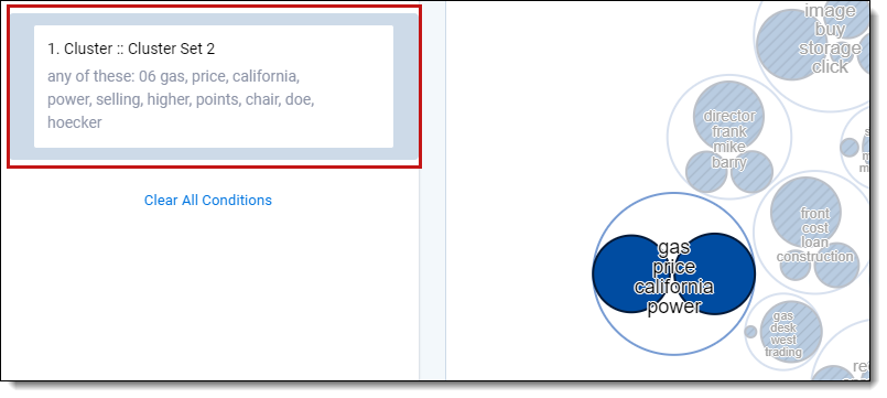
After you apply a filter based on selected clusters, you can edit it like any other filter by clicking on the filter card to open the configuration dialog.
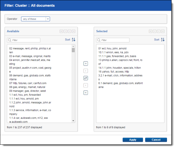
To add one or more specific clusters to a filter, select the cluster(s) and click  . To add all clusters on the Available list, click
  .
.
To remove one or more specific clusters from a filter, select the cluster(s) and click  . To remove all clusters from the Selected list, click
  .
.
Applying saved search and field filter conditions to your cluster visualization
Use the search panel to apply filters to your visualized data set based on saved searches, fields, and field values that exist in your workspace. You can apply these filters to all clusters or just selected clusters.
When you apply a saved search or field filter, a heat map is applied to the visualization panels, and the document list refreshes and shows only the documents that match your filter criteria. If you change the filter conditions on the search panel, the heat mapping is updated accordingly. See Understanding the Cluster Visualization heat map for more information regarding heat mapping. The conditions for the filter or saved search are added as an explicit AND statement under the selected cluster filter card if specific clusters are selected. See
Applying views to Cluster Visualization
Use the Views drop-down menu on the Documents tab to select and apply views with conditions to your cluster data. Selecting a view applies the conditions of the view to the heat mapping of the visualization panels and updates the list of documents and columns visible in the document list. You can also include relational items (e.g., Family). Adding in relational items doesn't change the cluster visualization heat mapping, but it does include family or relational items in your document list for any filter conditions you selected.
Heat mapping from a selected view works in the same way as applied filter conditions on the search panel. See Understanding the Cluster Visualization heat map for more information regarding heat mapping.
-
Deleting documents in the set
-
Switching to a document view that filters out documents
-
Changing conditions on the document view being used
-
Updating coding values or other metadata that affect which documents are included in the set
-
Changing user permissions so that the current user cannot see all documents in the set
To make it clear when a visualization is not showing all documents, multicolored cluster visualizations turn blue whenever a filter is applied. The following less-common situations can also cause the clusters to turn blue:
Most of the time, removing all filters from a visualization will return it to its normal state. If that doesn't work, we recommend checking that the document views, view conditions, and user permissions are set correctly, then rebuilding and re-visualizing the cluster.
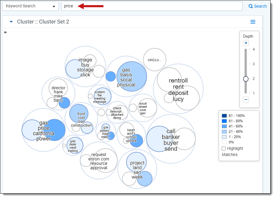
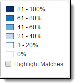
Understanding the Cluster Visualization heat map
Applying filters or a view automatically applies heat map shading to your cluster visualization. Heat mapping helps you identify clusters that contain the highest concentration of documents matching your filter or view criteria.
Circle pack Visualization
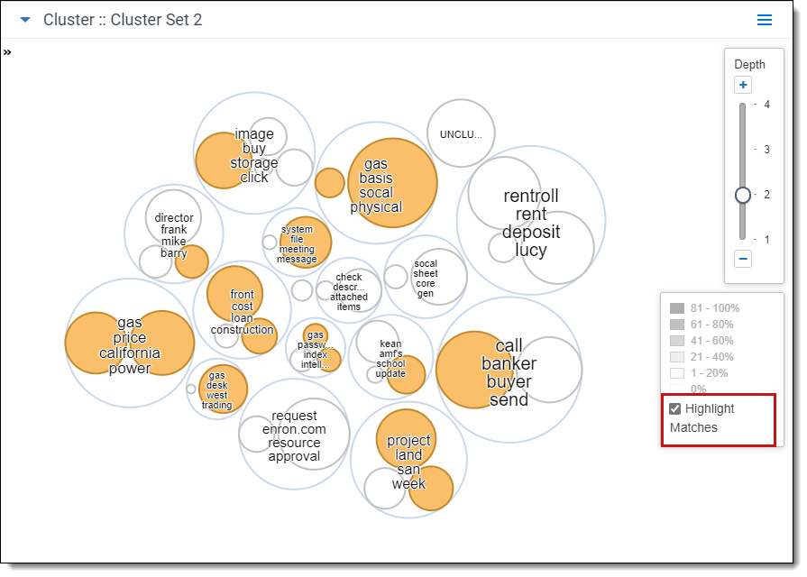
Use the legend on the visualization panel to gauge which clusters have the greatest percentage of matching documents. In addition, you can also use the highlight matches feature. See Highlighting matches (circle pack).
Dial Visualization
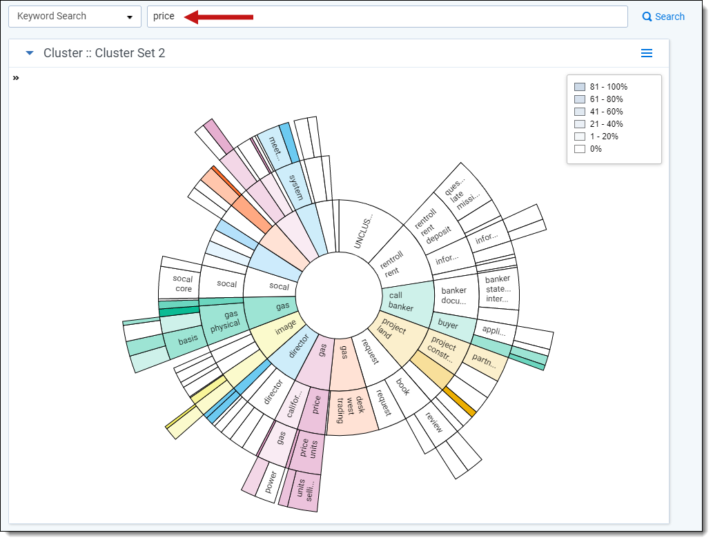
Use the legend on the visualization panel to gauge which clusters have the greatest percentage of matching documents. The legend values change color when the cursor hovers over different clusters. When the cursor is not hovering over a cluster, the legend values are grayed out.
Highlighting matches (circle pack)
When setting filter conditions in cluster visualization that match a relatively small number of important documents (e.g., hot documents), the cluster heat mapping displays a very light shade of blue to indicate a low matching percentage within the cluster. Check the Highlight Matches checkbox in the heat map legend to easily identify which clusters contain matching documents no matter how small the matching percentage. Matching clusters are highlighted in orange.
Working with the document list
The document list contains documents and columns based on a combination of the following:
- Clusters selected on the circle pack, dial and nearby clusters visualization panels
- The view selected on the Views drop-down menu
- Any relational items (e.g., Family) selected from the Related Items drop-down list
- Filters applied from the visualization panels
- Field or saved search filters applied on the search panel
Sampling clusters
You can create sample data sets and then save the results as a list by clicking the Sampling icon ![]() . These samples take into account all the following user selections:
. These samples take into account all the following user selections:
- Clusters selected on the circle pack, dial or nearby clusters visualization panels
- The view selected on the views drop-down menu
- Field or saved search filters applied on the search panel
When sampling is applied, the cluster visualization and heat mapping is updated automatically to reflect the selected sample. For more information on how to run samples of your data,